Wednesday, November 17, 2010

Poster Template

I kept to the codes and conventions of a movie poster when constructing my template. I did this by having a main image centered in the frame, a bold, clear title on the page and other information present on the page such as the tagline.

I wanted to have the background either blurred or just one colour in order to ensure the main focus is the main image.

Magazine Review Template

When constructing my magazine review template I kept to the common codes and conventions. I did this by having a main image which dominates the page. I also included a secondary image, a bold, clear title, a tagline and a star rating at the end of the review. From my research I found out that some reviews had extra information about the film such as details about the director, actors, length, plot etc so I thought it was best to include this in my review.

Codes And Conventions Of Short Film Posters


Cashback

This award winning, film follows the antics of the staff at a supermarket during the night shift. It is unequalled for originality, artistic quality and execution.

The film poster has a very basic design and layout. The audience is drawn to the woman who dominates the poster. Her clothes are pulled down but her naked body is covered by the title of the film. This is very effective because it makes the audience wonder why she is in this situation. She has a very plain facial expression which looks as if she is unaware of the fact that her clothes are pulled down.

The background is blurred to draw the audiences attention to the character but the background can still be established as a supermarket which is built further by the character holding a shopping basket. This makes the audience wonder why she is half naked in a supermarket which makes them interested in the film therefore it should encourage them to watch it.

The title is of a dark red colour and stretches across the whole poster. This immediately makes the audience aware of the films name and gives the audience a slight clue as to what the film may be about.


For The Birds

This short film is about a group of snooty birds roosting on a telephone wire who get what they deserve when a happy, larger bird drops in.

The movie has quite an innocent look to it which gives the audience a good idea of the films genre and age group. Vast amounts of blue has been used to give the poster a bright and happy effect to it. At the top of the poster there is the production company's name, this is very clear but does not dominate the page. The title of the film takes up a vast amounts of space and is very clear. This is good because it immediately tells the audience the title of the short film and gives them a good idea of the plot, genre etc. The main image is at the bottom of the poster and is of a number of small birds and one big one. This shows the nature of the film and highlights the characters in it.

Overall the poster gives a clear indication of the genre of the short film and who the short film is aimed at. This is done mostly by the use of images and bright colours.


The Lethal Innocents

This short film is about Rita, a 15 year old girl, who is relentlessly bullied by the queen bees. But when they kill her cat, they go one step too far.

This poster has a main image of the protagonist which dominates the page and is centered in the frame. It shows a girl with an unhappy and menacing look on her face which leads the audience to believe that she is up to something. The background is blurred in order to make the audience focus on the girl. This is a very effective technique which was also used in the 'Cashback' poster.

The title of the short film is positioned towards the bottom of the page and is in quite scruffy, white writing. This leads the audience to believe that the protagonist is of a lower class because of the untidy writing. This supports the stereotype that lower class people are quite untidy. This could be developed further by audiences thinking that violence could be involved. This gives the short film quite a negative image and shows a thriller genre. At the bottom of the page there are more details about the short film which gives audiences more information about the film.

Overall the poster is quite clear about the genre because of the style of writing used and the look of the protagonist.


From my research I believe that I should use appropriate colours in my film poster in order to make the audience aware of the genre and the nature of the film. I also believe that I should use one main image of the protagonist with maybe a blurred background to focus the audiences attention on the character. I believe the name of the short film should be bold and clear and a suitable font should be used to match the genre. I could also include other details about the film such as the main actors name, production company etc.

First Thoughts on Film Poster

I came across two movie posters from the films 'Due Date' and 'The Dark Knight'. I looked at these because they both focused on one character which I think I should do in mine because my short film is mostly made up of one actor/character. The 'Due Date' poster in particular inspired me the most because from the characters facial expressions the audience can see that he is not happy and this is what I want to portray in my poster. Also the taglines in the poster "If there's a hell, I'm already in it" and "Leave your comfort zone" supports the idea that he is not happy which leads me to believe that I should be considering an appropriate tagline for my short film.


I also came across a second poster from 'The Dark Knight' and a poster from 'Face/Off'. These two inspired me because they both represent two characters but in one poster symbolising a link between them. In 'The Dark Knight' poster the outline of 'Batman' is seen but with the 'Jokers' smile which shows two character in one which is good because it shows a connection and sort of keeps the audience guessing that is going to happen. In the 'Face/Off' poster one of the characters face is on the others face. This also shows a clear connection of the two characters. This is what I want to do in my short film because even though I have the same actor in both the happy and unhappy day they possess different personalities which I will need to portray in my poster.

Friday, November 12, 2010

Codes and Conventions of a Film Magazine Review

Machete Magazine Review

The first magazine review I analysed was 'Machete' by Empire magazine. The main feature of the review was a massive picture dominating the page and taking up most of the A3 spread. This was of the protagonist on a motorcycle with a machine gun. There is also a secondary image showing another character (Lindsay Lohan). The main purpose of both images is to attract the audience and to encourage them to read the article. I think this is quite effective because the two images symbolising women and violence would attract a great deal of people but mostly men. The images also give the audience a greater knowledge of the genre of the film. In this case the audience would assume the film is of a action genre.

The name of the film is in bold and capitals which is good because it clearly shows what the article is about. Beneath this there is the tagline of the film which is meant to give the reader a greater knowledge of what the film is about. The film review also further details of the film such as the release date, certificate, director, cast, running time and plot. This is good because the audience can decide whether they want to continue reading the review just by reading the first few lines. After this there is the main article which has a highlighted quote from it which is inserted to entice readers to actually read the review. The two page article ends with the writers verdict of the film and gives it a star rating.


Let Me In Magazine Review

This film review is also by Empire magazine. It is very similar to the previous review. The only difference was that there was not a secondary image. The primary image informs the audience that the film may be of a horror genre because the girl in the image has blood running down her face.


Up Magazine Review

This magazine review is from Total Film magazine unlike the previous two which were from Empire magazine. It has many of the features that the other reviews had but has a different layout and some of the features are different. The main image still dominates the article but takes up one A4 page unlike the other two which spreads across two A4 pages. This article uses a graph to express a review of all the different stages/chapters of the film which is good because it shows how detailed the review is.


Conclusion
To conclude I believe that my magazine review should include many features including a main image, maybe a secondary image (but not necessary), an overall rating of the film, a clear title, tagline and an overview of the film. My review will have to be quite detailed and take up vast amounts of space on the double page spread in order to attract readers and encourage them to read the review.

Tuesday, November 2, 2010

Animatic Feedback

After presenting my animatic to the class I had quite a lot of feedback. One comment was that it may be beneficial for me to favour the happy side. This would be good because it would give a more clearer contrast of the two sides. It would also encourage the audience to watch on because more activities are happening on the positive day. I think this will be reflected in my actual film because more sounds will be present on the positive day which means that his would most likely overpower the negative day.

Another comment was that I could have the positive sounds coming out of one side of the speakers/headphones and negative sounds coming out of the other side. This would be very effective but I think it would divide up the two days and not show a very clear contrast of them. It would also sort of make them into two different films which I am not aiming for.

A further comment was that some of my timing were not very effective. I agree with this because in the middle of the day I have not included many shots and it seemed to go by quite quickly in comparison to the rest of the day. I also did not include many shots of the characters traveling. This can be achieved by adding more shots when filming and by many adding a clock but speeded up in order to show the passing of time.

A final comment was that I could include some more shots towards the end of my film in order to tie the two days into one. This could be achieved by merging both screens into one maybe as they are going up the stairs or looking in the mirror.

Monday, November 1, 2010

Split Screen Research

In order to be able to complete my short film effectively I needed to find out how to split the screen in Adobe Premiere Pro CS3. I needed to do this because a large majority of my short film is in split screen in order to show the contrast between the two characters.

I researched this on the internet. The source I used is shown below -

http://www.heron-productions.com/4-splitscreen.html

Friday, October 29, 2010

Animatic Evaluation

I am very pleased with the outcome of my third and final draft of my animatic. This is because I have used vast amounts of sound effects in order to ensure the anmatic is easy to follow and to give it a greater sense of timing which should help me dramatically when filming and editing the real version of my short film.

I have used a wide range of different shots and angles to ensure the audience is draw into the film. I have also included vast amounts of arrows in my draws, which I included into my animatic. I did this in order to get a better understanding of what the characters and the camera is going to do at different points of the film. Such as if the character was going to move to the right or if the camera was going to zoom out.

Thursday, October 28, 2010

Why I changed the ending

I changed the ending of my short film. I changed it from a robber trying to enter the house of the happy person and the robber actually entering the unhappy persons house and robbing it to the happy person coming back from his date and then cleaning up after the unhappy person. I did this in order to, in some ways, shock the audience because throughout the short film they are lead to believe that these two characters are not related and maybe in some sort of parallel universe. I also thought that it would be best to only use a single screen towards the end of the short film in order to show the connection between the two characters.

I also thought that to introduce a new character, the robber, literally minutes before the short film ended would not be very effective and would not really interest the audience.

Final Animatic (Ending Changed)

Tuesday, October 19, 2010

Friday, October 15, 2010

Animatic Sound Effects

In order to improve my animatic I will need to add more sound effects to give myself a better image of what my final product will be like and to give me a better idea of timings.

I will need to add sound effects such as a door opening and closing and the dog barking for example. I will need to do this by downloading vast amounts of sounds off the internet then inserting them into my animatic.

I will download the sounds from the website, http://www.freesfx.co.uk/. I will get my sounds from this site because it has huge amounts of sounds clips which can be downloaded quickly and easily. It is also free to download the sounds.

Monday, October 11, 2010

Shooting Schedule

I will need to start shooting as soon as possible. This is to ensure I will have enough time to ensure all filming is completed to the very best of standards.

I think the best idea is to film the characters on different days. I am going to do this because even though I will have to go to the same locations on two separate occasions it is the best way because even though it is the same character they will have to wear different clothes and their hair will have to be different in order to show the different moods of the characters.

I will start by filming the happy day. This is because the weather will only get worse as the year goes on and I will require quite good weather on my happy day to show the characters mood through the weather. This therefore means that I will have to film the unhappy day on quite a dull day. This should show a clear contrast of the difference in mood of the characters.

Tuesday, October 5, 2010

Location Analysis

House 1

This is one of the houses which I am considering using for my short film. The opening scene will be filmed in the bedroom because it consists of the protagonist getting up. The last scene will also be filmed here because it consists of the protagonist going to bed. I believe this is a good location because it shows a typical young adults bedroom with film posters and shows that he is still living with his parents until he can get enough money to afford to move out. This bedroom is also quite spacious which is good for filming because the protagonist will be able to fit into the frame well.

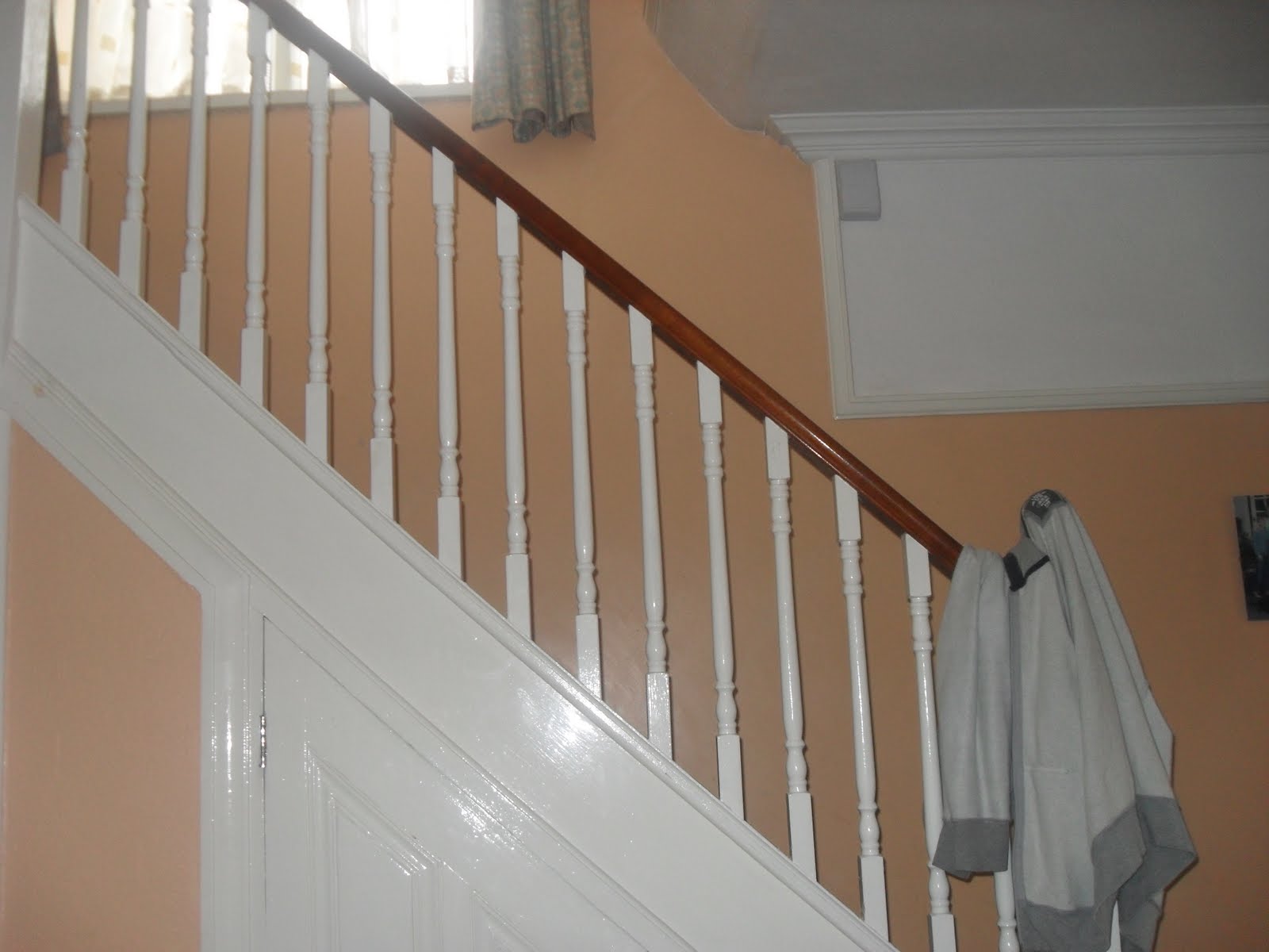
This house will be quite good for filming the character going down the stairs and out the door which will be required at many points throughout my short film. This is because the hallway is a reasonable size which means that the camera will be able to be positioned so the protagonist and other characters can fit nicely into the frame.

This is the driveway of this house. It is a good size which is very good because tracking of the protagonist going jogging in the morning can be framed well and the protagonist getting in the car can be shot very effectively. There is a window nearby the front door which is good because this means that the protagonist on the unhappy day will be able to climb through this because he forgets his key. Long shots can also be used of the characters coming out and going into the house which is important in my short film.

House 2


This is the bedroom of the second house. It is of a reasonable size but I do not think it would be a good place to film. This is because the protagonist gets up and goes to the bathroom in my short film and this location requires him to go round a corner which means the camera would be quite challenging to position. The scene of the protagonist looking out the window and phoning the police on the happy day may also be a challenge because the bed is positioned in front of the window unlike the other house.

Compared to the other house I believe that it would be quite challenging to film in. Even though shooting the protagonist going to the bathroom and going out and coming in the door could be filmed effectively, the hall away is quite small which means that the camera would not be able to capture the protagonist going up the stairs as well as the other house.


This is the driveway for this house. Filming would be successful in the driveway because long shots can be used in order to show the characters entering and coming out of the house. Shots of the protagonist getting in and out of the car would be quite easy to do because of the size of the driveway. There is also a window close to the front door which would be good to film the protagonist climbing through on the unhappy day.
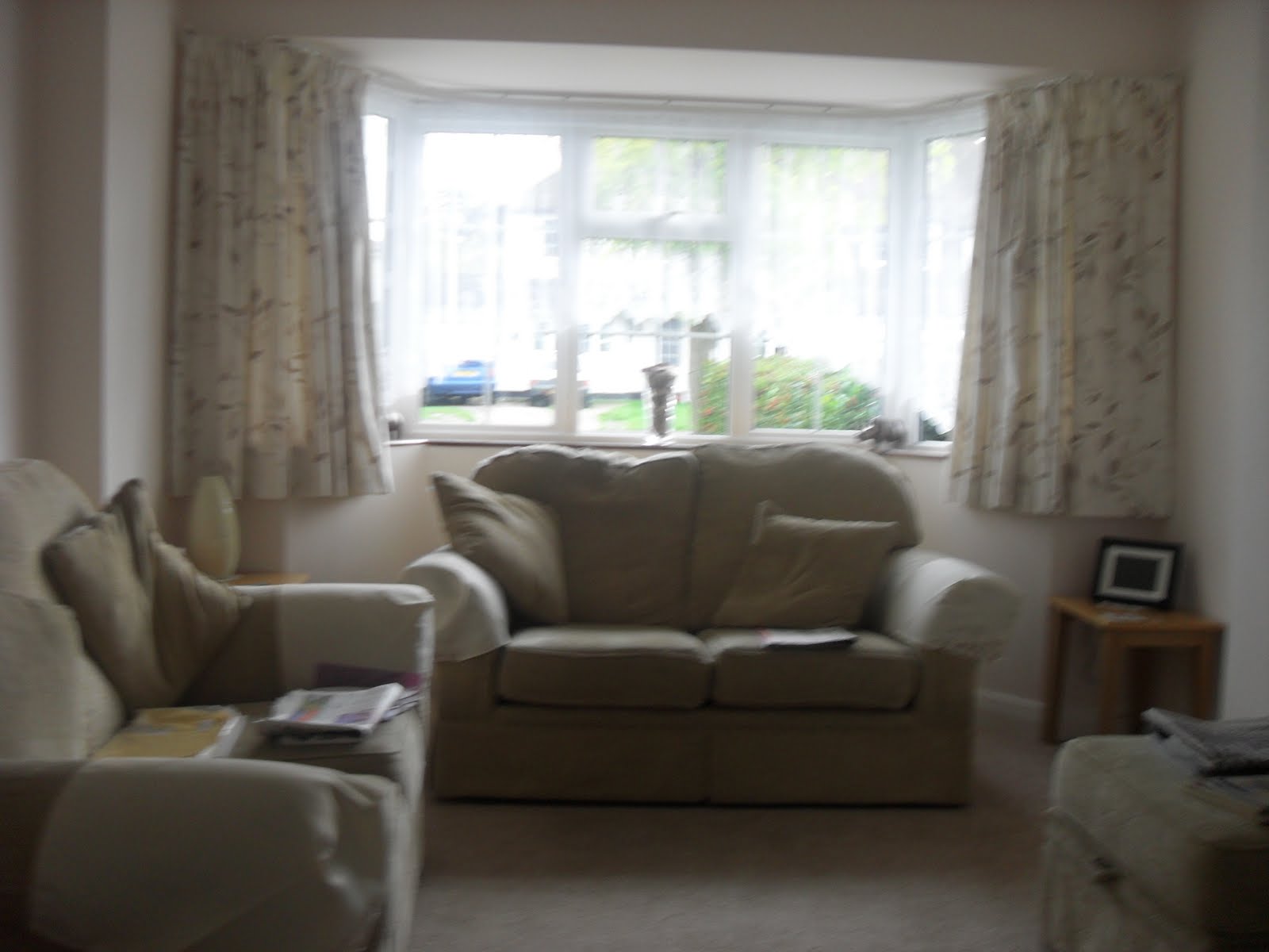
This is a image of the houses living room. The protagonist would climb through the window in this room in order to get into the house. This may be a problem because the sofa is positioned right by the window. This could be overcome by moving the sofa. The window in the other house leads to a rather empty space which would be good when filming. But on the other hand the main character could fall over the sofa to build on the fact that he is having a bad day. This will be where the protagonist will be spending most of his evening watching television on the first day. This would be quite good to film because it is a fairly big room which means a wide variety of shots and camera angles can be used.

This is the dining room of the second house. This is where the protagonist and the girl will be having dinner. It is a fairly big room which means that filming would be quite successful because a variety of angles can be used and the characters will easily fit into the frame.


Overall
Overall I believe that house number two would be best for filming. Even though it has some potential filming problems I believe they can be overcome. I also believe that a larger variety of shots can be achieved by filming here therefore making my short a greater success than filming at the other house.

Other locations
This is a picture of a car park in Uxbridge where the protagonist can park in order to show the comparison between the parking on the good day and the parking on the bad day. I chose this car park because it is of a reasonable size which means long shots can be used to clearly show the parking.


This is a image of an area located in Uxbridge where I thought it would be good have have shots of the protagonist walking to work.I thought this because the area is very spacious which means the character can fit in the frame and a variety of shots can be used.


This is a image of the cinema located in Gerrards Cross. I chose this cinema because it is easy to access and long shots can be used of the characters going to the cinema because the entrance is outside unlike other cinemas which tend to be located in a shopping centre.

Second Character

My second character in my short film will be a girl who my protagonist meets whilst at work.She will go round his house later in the day and then will go to the cinema with him. The protagonist will then walk her home after the cinema.

I chose Rachel Shea for this role. This is because she is a very happy person who I think can portray the role of the protagonists date on the happy day extremely well. Rachel will also suit the role well because she has completed a drama course which means she has some good acting experience which should contribute well to my short film.