Possible Filming dates -
Saturday 15th January
Tuesday 18th January
Key dates to complete filming -
Saturday 22nd/Sunday 23rd January
Saturday 29th/Sunday 30th January
Main target to complete all filming and start editing by 1st February
Monday, January 10, 2011

Script
My short film does not require large amounts of talking scenes but some interaction is required between the protagonist and the second character (Rachel Shea) on both the split screens.
First time they meet - Happy
David - Hi there, can I help you?
Rachel - Yeah I was wondering how access the main part of the shop
David - Well you go up the lift to the first floor and the shop should be the first thing you see. Is that ok?
Rachel - Yeah thats really helpful thanks. Have you worked here long?
David - Not long really. I only joined a few months ago and only work part time. I am studying to become a vet at the moment.
Rachel - Really? I am studying to become a vet too.
David - Wow small world. We should meet up and talk more about this.
Rachel - Yeah that would be good.
David - Well I'm not doing anything tonight. How about it?
Rachel - Yeah that would be good.
David - Heres my number. (hand piece of paper with number on)
Rachel - Thanks. I will text you later.
David - My names David by the way.
Rachel - Mines Rachel.
David - Alright. Hope to see you soon.
Rachel - Bye
David - Bye
First time they meet - Unhappy
Rachel - Excuse me how do you access the main part of the shop?
David - Over there (points/not bothered about helping)
Rachel - Thanks (walks off)
Texting whilst having lunch - Happy day
Rachel - Hi. Its Rachel. You still up for tonight?
David - Yeah sure did you want to come over to mine for a meal at like six then we can go to the cinema.
Rachel - Yeah sure that would be good. See you soon.
David - Can't wait.
Rachel comes to the house - Happy day
(Door bell) (Opens door)
Rachel - Hello
David - Hello come in, come in.
Rachel - Thanks how are you?
David - All good thanks. You ok? Can I take your coat?
Rachel - Yeah I'm good. Yeah sure. (Takes off coat and gives it to David)
David - (Puts coat on rail) DO come through. I'm just cooking dinner.
(Both walk through into the dining room.)
(Fade out of the conversation so the sound effects are the same on both split screens)
First time they meet - Happy
David - Hi there, can I help you?
Rachel - Yeah I was wondering how access the main part of the shop
David - Well you go up the lift to the first floor and the shop should be the first thing you see. Is that ok?
Rachel - Yeah thats really helpful thanks. Have you worked here long?
David - Not long really. I only joined a few months ago and only work part time. I am studying to become a vet at the moment.
Rachel - Really? I am studying to become a vet too.
David - Wow small world. We should meet up and talk more about this.
Rachel - Yeah that would be good.
David - Well I'm not doing anything tonight. How about it?
Rachel - Yeah that would be good.
David - Heres my number. (hand piece of paper with number on)
Rachel - Thanks. I will text you later.
David - My names David by the way.
Rachel - Mines Rachel.
David - Alright. Hope to see you soon.
Rachel - Bye
David - Bye
First time they meet - Unhappy
Rachel - Excuse me how do you access the main part of the shop?
David - Over there (points/not bothered about helping)
Rachel - Thanks (walks off)
Texting whilst having lunch - Happy day
Rachel - Hi. Its Rachel. You still up for tonight?
David - Yeah sure did you want to come over to mine for a meal at like six then we can go to the cinema.
Rachel - Yeah sure that would be good. See you soon.
David - Can't wait.
Rachel comes to the house - Happy day
(Door bell) (Opens door)
Rachel - Hello
David - Hello come in, come in.
Rachel - Thanks how are you?
David - All good thanks. You ok? Can I take your coat?
Rachel - Yeah I'm good. Yeah sure. (Takes off coat and gives it to David)
David - (Puts coat on rail) DO come through. I'm just cooking dinner.
(Both walk through into the dining room.)
(Fade out of the conversation so the sound effects are the same on both split screens)
Magazine Review Planning
Director - Steven Jones
Screenwriters -Steven Jones
Cast - David Green, Rachel Shea
Running time - 6 minutes Approx.
Plot - Set in an average surban area a comparison of two brothers choices is shown. But what choices are the best?
Main Article - When I first came across Steven Jones's short film, "Connected", I did not really know what to expect. I was pleasantly surprised by the unique and clever use of split screen throughout the film which is not normally seen in today's media. The use of split screen was very effective and a clever comparison of the two protagonists personalities was show very clearly.
The character development was clearly shown throughout the short. Both the characters possessed very different personalities which both developed throughout the short by the brilliant acting skills of the protagonist clearly showing the different personalities that the two characters possess in the film. The choices that the two protagonists made and the way they interacted with other characters made me almost feel as if I could connect with them because one was happy and one was unhappy and everyone has their own happy and unhappy days.
VERDICT - A down to earth short, focusing on the personality choices we have to make on a daily basis. Generally entertaining and remarkably clever.
Screenwriters -Steven Jones
Cast - David Green, Rachel Shea
Running time - 6 minutes Approx.
Plot - Set in an average surban area a comparison of two brothers choices is shown. But what choices are the best?
Main Article - When I first came across Steven Jones's short film, "Connected", I did not really know what to expect. I was pleasantly surprised by the unique and clever use of split screen throughout the film which is not normally seen in today's media. The use of split screen was very effective and a clever comparison of the two protagonists personalities was show very clearly.
The character development was clearly shown throughout the short. Both the characters possessed very different personalities which both developed throughout the short by the brilliant acting skills of the protagonist clearly showing the different personalities that the two characters possess in the film. The choices that the two protagonists made and the way they interacted with other characters made me almost feel as if I could connect with them because one was happy and one was unhappy and everyone has their own happy and unhappy days.
VERDICT - A down to earth short, focusing on the personality choices we have to make on a daily basis. Generally entertaining and remarkably clever.
Tasks To-do
-Complete final film poster - add certificate/release date and line up the two faces from the top of the page.
-Start more filming and editing (Camera three) - Re-shoot character running out the door because of xmas lights. (Take out camera and laptop)
-Start planning and complete movie poster
-Start more filming and editing (Camera three) - Re-shoot character running out the door because of xmas lights. (Take out camera and laptop)
-Start planning and complete movie poster
Saturday, January 1, 2011
New Idea for Short Film Poster

I changed the idea of my movie poster because I though having the two faces in parallel to each other would have a better contrast of emotion. In this poster the faces both look natural unlike my first attempt at constructing my poster where the nose did not line up. The colouring that I used is also very effective because it gives off a mysterious effect to it and the tagline builds on this further.
Wednesday, December 29, 2010
First Draft of my Short Film Poster

I was reasonably pleased with my first draft of my short film poster. I really like the overall colours I used for it because it makes the character in it stand out and a clear comparison of the two emotions can be clearly seen. I was also pleased with the text that I used and how well it stood out against the black background.
The nose and the mouth are really my only issue with this. The hair lines up perfectly which is good because it makes the audience believe that it is the same image. The nose and mouth on the other hand does not. I am not to worried about the mouth because the different emotion should change the mouth but I believe that the nose could be lined up more effectively.
I may have to take the pictures of the characters two emotions again in order to make the nose line up better.
Friday, December 10, 2010
Tagline of my Short Film
In order to encourage people to watch my short film I thought it would be a good idea to include a tag line on both my poster and magazine review. My tag line needed to stand out in order to encourage people to actually watch the film.
First thoughts -
"Two men, one house, two personalities"
I was not very convinced with this tag line. This is because I want the audience to be surprised by the ending and this tag line gives away that they are two different people and not just the same person on different days.
"Make you're own choices?"
I thought this tag line was reasonably good. This is good because the two characters make their own personality choices and the short film is meant to put across the message that if you are happy more activities can be achieved and more can be gained from being happy. On the other hand I do not think that this tag line would be able to grab the audience and encourage them to watch the short film.
"How many people are the same?"
I thought this tag line was very good. This is because it really leaves the audience wondering what it actually means which should therefore encourage them to actually watch the short film therefore making it a success.
Overall I think that "How many people are the same?" is the best tag line for my short film. This is because it is mysterious which should encourage people to watch my short film and I believe it suits the plot of my short film.
First thoughts -
"Two men, one house, two personalities"
I was not very convinced with this tag line. This is because I want the audience to be surprised by the ending and this tag line gives away that they are two different people and not just the same person on different days.
"Make you're own choices?"
I thought this tag line was reasonably good. This is good because the two characters make their own personality choices and the short film is meant to put across the message that if you are happy more activities can be achieved and more can be gained from being happy. On the other hand I do not think that this tag line would be able to grab the audience and encourage them to watch the short film.
"How many people are the same?"
I thought this tag line was very good. This is because it really leaves the audience wondering what it actually means which should therefore encourage them to actually watch the short film therefore making it a success.
Overall I think that "How many people are the same?" is the best tag line for my short film. This is because it is mysterious which should encourage people to watch my short film and I believe it suits the plot of my short film.
Friday, December 3, 2010
Fonts for Poster
My short film is a drama. This means that I would prefer to have quite a basic but bold, clear font on my poster. I research a great deal of fonts but narrowed it down to just a few.

My favourite font for the title is Charlemagne STD. This is because it is very clear and draws the reader in so they will immediately aware of the short films name. I also think that the fonts use of capitals is very effective and will be very beneficial in my poster.

My favourite font for the title is Charlemagne STD. This is because it is very clear and draws the reader in so they will immediately aware of the short films name. I also think that the fonts use of capitals is very effective and will be very beneficial in my poster.
Name Ideas for Short Film
Connected - I think this is a good, strong name for my short film. This is because it relates the two characters in the short film together and makes the audience aware that there is a connection. It is short and to the point which is good and should encourage people to watch the film.
Brothers - This is also a possible name for my short film. In the short film the characters are going to brother because they are the same person which means that in order for the audience to follow the plot easily they would need to know this. On the other hand I think this name might give too much away before watching the film. This is because the audience should think that the two people are the same until the end of the film but with this name they would be lead to think that they are brother from the start. This therefore means that the shock at the end would not be as effective.
Emotion - This title is also a possible because both characters each possess different emotions depending on their attitude. Even though this is a related name the audience might be lead to believe that it is a romance short film instead of a drama.
Overall I think that Connected would suit my short film the best because it supports the plot and with a name like this I think that people would be encouraged to watch it.
Brothers - This is also a possible name for my short film. In the short film the characters are going to brother because they are the same person which means that in order for the audience to follow the plot easily they would need to know this. On the other hand I think this name might give too much away before watching the film. This is because the audience should think that the two people are the same until the end of the film but with this name they would be lead to think that they are brother from the start. This therefore means that the shock at the end would not be as effective.
Emotion - This title is also a possible because both characters each possess different emotions depending on their attitude. Even though this is a related name the audience might be lead to believe that it is a romance short film instead of a drama.
Overall I think that Connected would suit my short film the best because it supports the plot and with a name like this I think that people would be encouraged to watch it.
Wednesday, November 17, 2010
Poster Template
I kept to the codes and conventions of a movie poster when constructing my template. I did this by having a main image centered in the frame, a bold, clear title on the page and other information present on the page such as the tagline.
I wanted to have the background either blurred or just one colour in order to ensure the main focus is the main image.

I wanted to have the background either blurred or just one colour in order to ensure the main focus is the main image.

Magazine Review Template
When constructing my magazine review template I kept to the common codes and conventions. I did this by having a main image which dominates the page. I also included a secondary image, a bold, clear title, a tagline and a star rating at the end of the review. From my research I found out that some reviews had extra information about the film such as details about the director, actors, length, plot etc so I thought it was best to include this in my review.


Codes And Conventions Of Short Film Posters

Cashback
This award winning, film follows the antics of the staff at a supermarket during the night shift. It is unequalled for originality, artistic quality and execution.
The film poster has a very basic design and layout. The audience is drawn to the woman who dominates the poster. Her clothes are pulled down but her naked body is covered by the title of the film. This is very effective because it makes the audience wonder why she is in this situation. She has a very plain facial expression which looks as if she is unaware of the fact that her clothes are pulled down.
The background is blurred to draw the audiences attention to the character but the background can still be established as a supermarket which is built further by the character holding a shopping basket. This makes the audience wonder why she is half naked in a supermarket which makes them interested in the film therefore it should encourage them to watch it.
The title is of a dark red colour and stretches across the whole poster. This immediately makes the audience aware of the films name and gives the audience a slight clue as to what the film may be about.

 For The Birds
This short film is about a group of snooty birds roosting on a telephone wire who get what they deserve when a happy, larger bird drops in.
The movie has quite an innocent look to it which gives the audience a good idea of the films genre and age group. Vast amounts of blue has been used to give the poster a bright and happy effect to it. At the top of the poster there is the production company's name, this is very clear but does not dominate the page. The title of the film takes up a vast amounts of space and is very clear. This is good because it immediately tells the audience the title of the short film and gives them a good idea of the plot, genre etc. The main image is at the bottom of the poster and is of a number of small birds and one big one. This shows the nature of the film and highlights the characters in it.
Overall the poster gives a clear indication of the genre of the short film and who the short film is aimed at. This is done mostly by the use of images and bright colours.

 The Lethal Innocents
This short film is about Rita, a 15 year old girl, who is relentlessly bullied by the queen bees. But when they kill her cat, they go one step too far.
This poster has a main image of the protagonist which dominates the page and is centered in the frame. It shows a girl with an unhappy and menacing look on her face which leads the audience to believe that she is up to something. The background is blurred in order to make the audience focus on the girl. This is a very effective technique which was also used in the 'Cashback' poster.
The title of the short film is positioned towards the bottom of the page and is in quite scruffy, white writing. This leads the audience to believe that the protagonist is of a lower class because of the untidy writing. This supports the stereotype that lower class people are quite untidy. This could be developed further by audiences thinking that violence could be involved. This gives the short film quite a negative image and shows a thriller genre. At the bottom of the page there are more details about the short film which gives audiences more information about the film.
Overall the poster is quite clear about the genre because of the style of writing used and the look of the protagonist.

From my research I believe that I should use appropriate colours in my film poster in order to make the audience aware of the genre and the nature of the film. I also believe that I should use one main image of the protagonist with maybe a blurred background to focus the audiences attention on the character. I believe the name of the short film should be bold and clear and a suitable font should be used to match the genre. I could also include other details about the film such as the main actors name, production company etc.
First Thoughts on Film Poster
I came across two movie posters from the films 'Due Date' and 'The Dark Knight'. I looked at these because they both focused on one character which I think I should do in mine because my short film is mostly made up of one actor/character. The 'Due Date' poster in particular inspired me the most because from the characters facial expressions the audience can see that he is not happy and this is what I want to portray in my poster. Also the taglines in the poster "If there's a hell, I'm already in it" and "Leave your comfort zone" supports the idea that he is not happy which leads me to believe that I should be considering an appropriate tagline for my short film.

I also came across a second poster from 'The Dark Knight' and a poster from 'Face/Off'. These two inspired me because they both represent two characters but in one poster symbolising a link between them. In 'The Dark Knight' poster the outline of 'Batman' is seen but with the 'Jokers' smile which shows two character in one which is good because it shows a connection and sort of keeps the audience guessing that is going to happen. In the 'Face/Off' poster one of the characters face is on the others face. This also shows a clear connection of the two characters. This is what I want to do in my short film because even though I have the same actor in both the happy and unhappy day they possess different personalities which I will need to portray in my poster.


I also came across a second poster from 'The Dark Knight' and a poster from 'Face/Off'. These two inspired me because they both represent two characters but in one poster symbolising a link between them. In 'The Dark Knight' poster the outline of 'Batman' is seen but with the 'Jokers' smile which shows two character in one which is good because it shows a connection and sort of keeps the audience guessing that is going to happen. In the 'Face/Off' poster one of the characters face is on the others face. This also shows a clear connection of the two characters. This is what I want to do in my short film because even though I have the same actor in both the happy and unhappy day they possess different personalities which I will need to portray in my poster.

Friday, November 12, 2010
Codes and Conventions of a Film Magazine Review
Machete Magazine Review
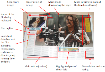
The first magazine review I analysed was 'Machete' by Empire magazine. The main feature of the review was a massive picture dominating the page and taking up most of the A3 spread. This was of the protagonist on a motorcycle with a machine gun. There is also a secondary image showing another character (Lindsay Lohan). The main purpose of both images is to attract the audience and to encourage them to read the article. I think this is quite effective because the two images symbolising women and violence would attract a great deal of people but mostly men. The images also give the audience a greater knowledge of the genre of the film. In this case the audience would assume the film is of a action genre.
The name of the film is in bold and capitals which is good because it clearly shows what the article is about. Beneath this there is the tagline of the film which is meant to give the reader a greater knowledge of what the film is about. The film review also further details of the film such as the release date, certificate, director, cast, running time and plot. This is good because the audience can decide whether they want to continue reading the review just by reading the first few lines. After this there is the main article which has a highlighted quote from it which is inserted to entice readers to actually read the review. The two page article ends with the writers verdict of the film and gives it a star rating.
Let Me In Magazine Review
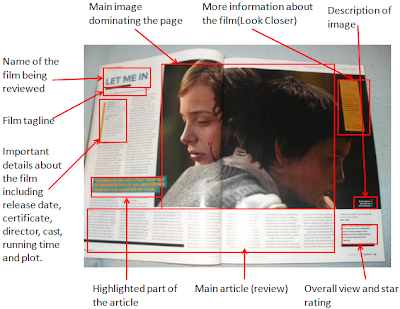
This film review is also by Empire magazine. It is very similar to the previous review. The only difference was that there was not a secondary image. The primary image informs the audience that the film may be of a horror genre because the girl in the image has blood running down her face.
Up Magazine Review
This magazine review is from Total Film magazine unlike the previous two which were from Empire magazine. It has many of the features that the other reviews had but has a different layout and some of the features are different. The main image still dominates the article but takes up one A4 page unlike the other two which spreads across two A4 pages. This article uses a graph to express a review of all the different stages/chapters of the film which is good because it shows how detailed the review is.

Conclusion
To conclude I believe that my magazine review should include many features including a main image, maybe a secondary image (but not necessary), an overall rating of the film, a clear title, tagline and an overview of the film. My review will have to be quite detailed and take up vast amounts of space on the double page spread in order to attract readers and encourage them to read the review.
The first magazine review I analysed was 'Machete' by Empire magazine. The main feature of the review was a massive picture dominating the page and taking up most of the A3 spread. This was of the protagonist on a motorcycle with a machine gun. There is also a secondary image showing another character (Lindsay Lohan). The main purpose of both images is to attract the audience and to encourage them to read the article. I think this is quite effective because the two images symbolising women and violence would attract a great deal of people but mostly men. The images also give the audience a greater knowledge of the genre of the film. In this case the audience would assume the film is of a action genre.
The name of the film is in bold and capitals which is good because it clearly shows what the article is about. Beneath this there is the tagline of the film which is meant to give the reader a greater knowledge of what the film is about. The film review also further details of the film such as the release date, certificate, director, cast, running time and plot. This is good because the audience can decide whether they want to continue reading the review just by reading the first few lines. After this there is the main article which has a highlighted quote from it which is inserted to entice readers to actually read the review. The two page article ends with the writers verdict of the film and gives it a star rating.

Let Me In Magazine Review
This film review is also by Empire magazine. It is very similar to the previous review. The only difference was that there was not a secondary image. The primary image informs the audience that the film may be of a horror genre because the girl in the image has blood running down her face.

Up Magazine Review
This magazine review is from Total Film magazine unlike the previous two which were from Empire magazine. It has many of the features that the other reviews had but has a different layout and some of the features are different. The main image still dominates the article but takes up one A4 page unlike the other two which spreads across two A4 pages. This article uses a graph to express a review of all the different stages/chapters of the film which is good because it shows how detailed the review is.

Conclusion
To conclude I believe that my magazine review should include many features including a main image, maybe a secondary image (but not necessary), an overall rating of the film, a clear title, tagline and an overview of the film. My review will have to be quite detailed and take up vast amounts of space on the double page spread in order to attract readers and encourage them to read the review.
Tuesday, November 2, 2010
Animatic Feedback
After presenting my animatic to the class I had quite a lot of feedback. One comment was that it may be beneficial for me to favour the happy side. This would be good because it would give a more clearer contrast of the two sides. It would also encourage the audience to watch on because more activities are happening on the positive day. I think this will be reflected in my actual film because more sounds will be present on the positive day which means that his would most likely overpower the negative day.
Another comment was that I could have the positive sounds coming out of one side of the speakers/headphones and negative sounds coming out of the other side. This would be very effective but I think it would divide up the two days and not show a very clear contrast of them. It would also sort of make them into two different films which I am not aiming for.
A further comment was that some of my timing were not very effective. I agree with this because in the middle of the day I have not included many shots and it seemed to go by quite quickly in comparison to the rest of the day. I also did not include many shots of the characters traveling. This can be achieved by adding more shots when filming and by many adding a clock but speeded up in order to show the passing of time.
A final comment was that I could include some more shots towards the end of my film in order to tie the two days into one. This could be achieved by merging both screens into one maybe as they are going up the stairs or looking in the mirror.
Another comment was that I could have the positive sounds coming out of one side of the speakers/headphones and negative sounds coming out of the other side. This would be very effective but I think it would divide up the two days and not show a very clear contrast of them. It would also sort of make them into two different films which I am not aiming for.
A further comment was that some of my timing were not very effective. I agree with this because in the middle of the day I have not included many shots and it seemed to go by quite quickly in comparison to the rest of the day. I also did not include many shots of the characters traveling. This can be achieved by adding more shots when filming and by many adding a clock but speeded up in order to show the passing of time.
A final comment was that I could include some more shots towards the end of my film in order to tie the two days into one. This could be achieved by merging both screens into one maybe as they are going up the stairs or looking in the mirror.
Subscribe to:
Posts (Atom)