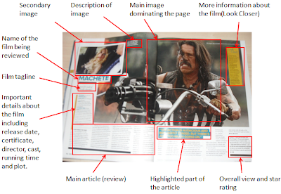
The first magazine review I analysed was 'Machete' by Empire magazine. The main feature of the review was a massive picture dominating the page and taking up most of the A3 spread. This was of the protagonist on a motorcycle with a machine gun. There is also a secondary image showing another character (Lindsay Lohan). The main purpose of both images is to attract the audience and to encourage them to read the article. I think this is quite effective because the two images symbolising women and violence would attract a great deal of people but mostly men. The images also give the audience a greater knowledge of the genre of the film. In this case the audience would assume the film is of a action genre.
The name of the film is in bold and capitals which is good because it clearly shows what the article is about. Beneath this there is the tagline of the film which is meant to give the reader a greater knowledge of what the film is about. The film review also further details of the film such as the release date, certificate, director, cast, running time and plot. This is good because the audience can decide whether they want to continue reading the review just by reading the first few lines. After this there is the main article which has a highlighted quote from it which is inserted to entice readers to actually read the review. The two page article ends with the writers verdict of the film and gives it a star rating.

Let Me In Magazine Review
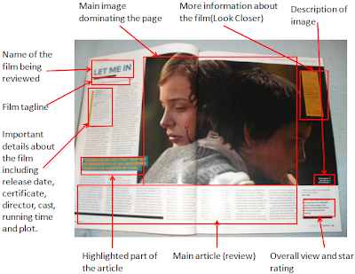
This film review is also by Empire magazine. It is very similar to the previous review. The only difference was that there was not a secondary image. The primary image informs the audience that the film may be of a horror genre because the girl in the image has blood running down her face.

Up Magazine Review
This magazine review is from Total Film magazine unlike the previous two which were from Empire magazine. It has many of the features that the other reviews had but has a different layout and some of the features are different. The main image still dominates the article but takes up one A4 page unlike the other two which spreads across two A4 pages. This article uses a graph to express a review of all the different stages/chapters of the film which is good because it shows how detailed the review is.

Conclusion
To conclude I believe that my magazine review should include many features including a main image, maybe a secondary image (but not necessary), an overall rating of the film, a clear title, tagline and an overview of the film. My review will have to be quite detailed and take up vast amounts of space on the double page spread in order to attract readers and encourage them to read the review.
No comments:
Post a Comment